Nowadays, almost all modern WordPress sites contain contact forms. Yet, most of the sites hardly generate leads from them. Do you know why? Due to simple yet costly WordPress Contact Form Mistakes.
Even though there are dozens of websites where traffic is excellent. But when you look at the conversion numbers, they are surprisingly low. When looked at more closely, it is seen that it is not the source of traffic or any other factors that make your visitors hesitant to convert. It is the form mistakes or poorly optimized forms that create friction.
These form mistakes are like poorly designed forms, too many unnecessary fields, irrelevant placement of the form, lack of spam filtering, and many more. All these mistakes create a frustrating experience for visitors and reduce the chances of form submissions.
If you do not want these form mistakes to quietly reduce your leads and revenue, it is time to take a closer look at your forms. Go through this practical breakdown of the most common contact form mistakes and learn how to fix them. Also, don’t miss the last part, there’s a bonus for you.
So without talking anymore, let’s dive in…
Most of these WordPress form mistakes will not show up in your error logs or analytics. They work quietly, turning away real visitors, swallowing genuine leads, and eroding trust before a single conversation begins. Each mistake and the relevant consequences are listed below.
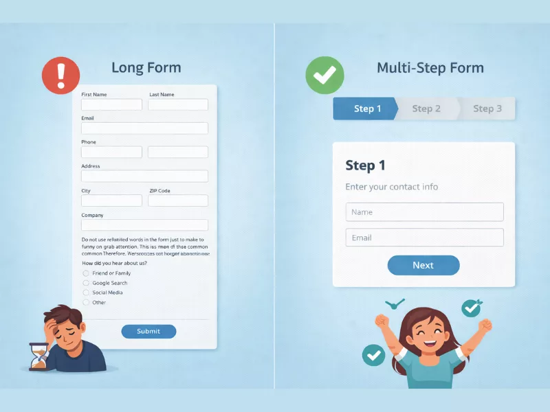
Normally, 27% of users completely abandon the form if it is too long. Often, we become carried away and add too many unnecessary fields, which later makes the form cluttered. This is one of the most common WordPress contact form mistakes ever. Therefore, due to the unwillingness to fill out a long-form form, people abandon it. Now, how can you overcome this?

This is one of the most ignored WordPress contact form mistakes, which is giving no attention to designing or customizing the form. That’s why most forms look generic and unprofessional. Your form is part of your brand image. If it looks outdated, crowded, or visually unpleasing, users will hesitate. Even small design flaws can reduce confidence, and when trust drops, completion rates automatically follow.
What is poor styling? Improper spacing between fields, mismatched fonts, scattered form fields, buttons that do not match the brand colors, labels that are hard to read, etc. These things actually make or break the look of a WordPress form. So, to avoid this mistake, you can follow these form design best practices:
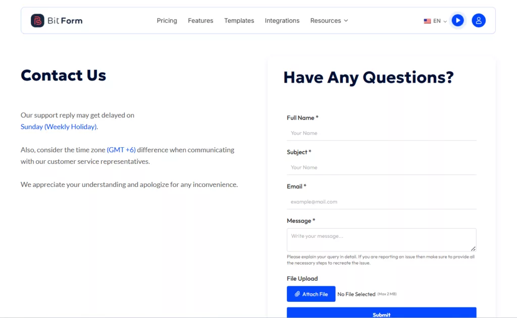
All these adjustments will provide clarity and guide users. Eventually, increasing the form completion rate. All well styled, clean form will look something like this.
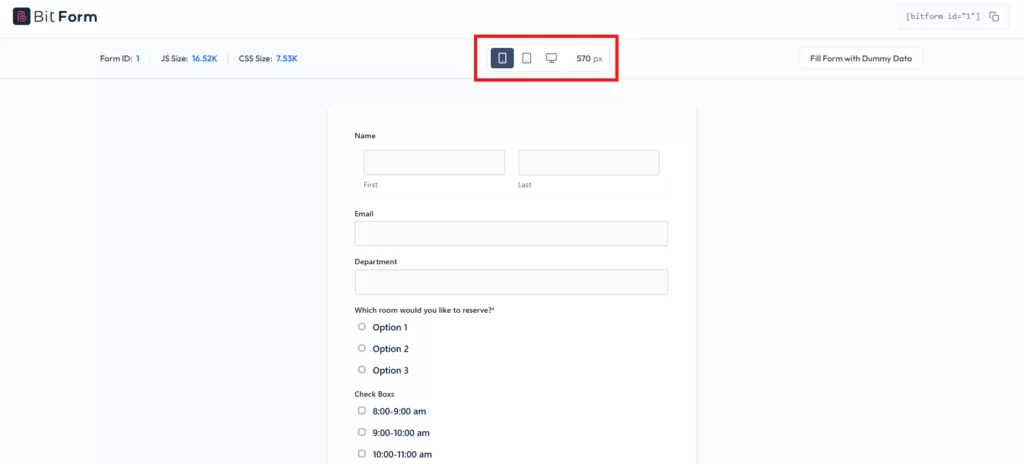
Over 60% of global web traffic now comes from mobile devices. Just imagine how serious this WordPress form mistake is. Your form works fine on desktops, but only breaks on mobile. This frustrates users since the majority of them browse websites from the phone.
So, to give your users a seamless form experience, make sure they are mobile-friendly. For example, the form fields, buttons, and labels should adjust according to the screen size. Plus, if you could preview and test your form on an actual phone before publishing it, it would be even better. This will create a positive impression on users.
Surely, with these contact form best practises, you can optimize your WordPress forms for different screens. At the present time, almost all WordPress form builders provide mobile responsiveness. One such form builder is Bit Form. It allows you to check your form on different devices.
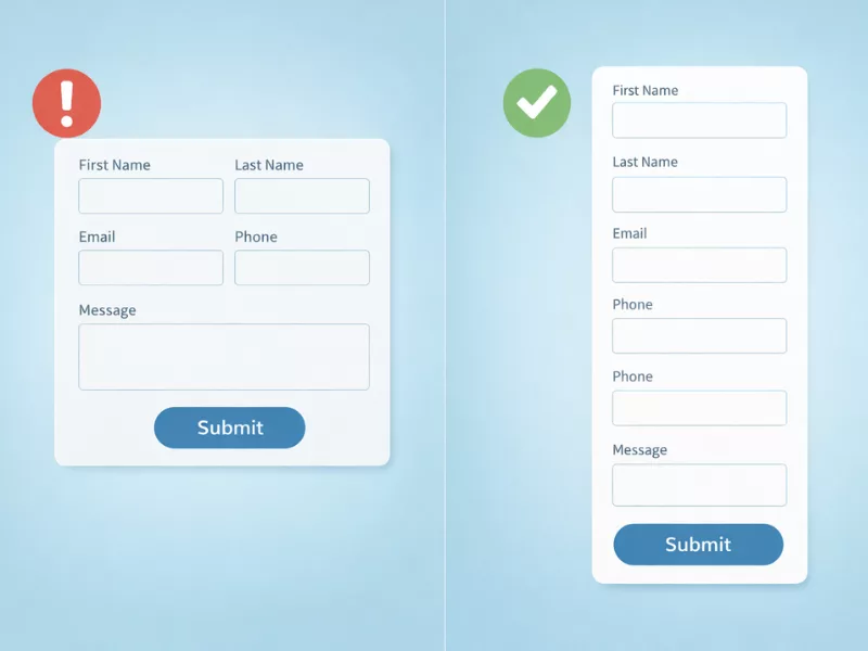
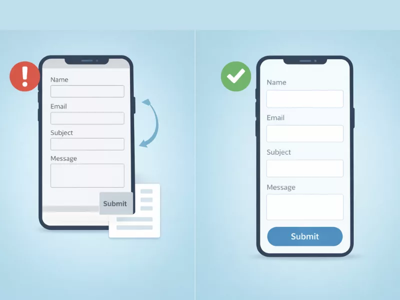
Multi-column forms do look nice, but to a certain extent. If you put 3 fields side by side, it might look great on larger screens, but it will be too complicated for small screens. Users feel discomfort everytime to scroll side to read and complete the fields.
This is one of the WordPress contact form mistakes that no one talks about. However, the fix is simple. Try to use single column layout for all your forms, use less multi columns. They work perfectly on every screen size, look clean, and keep the user moving forward without confusion.
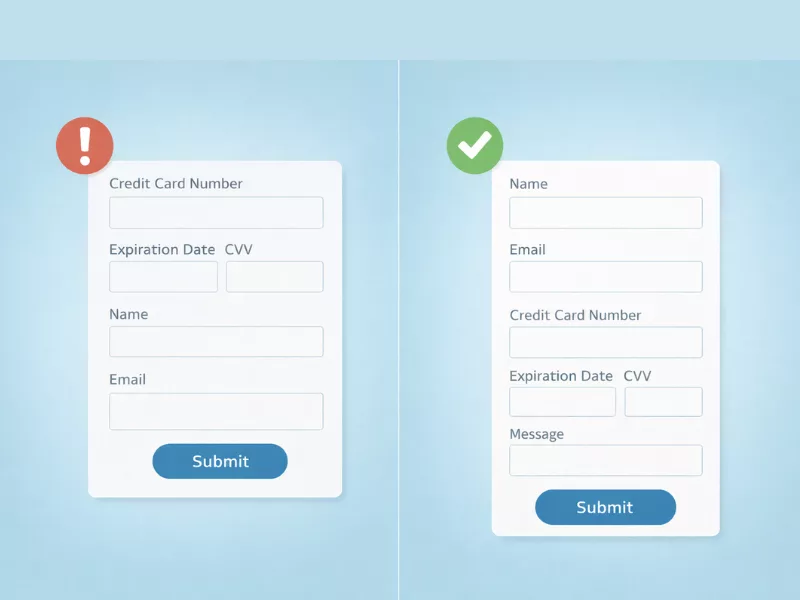
The order of your form fields matters more than most people realize. If users have to jump between unrelated questions, it breaks their focus and makes the form feel disorganized. For example, asking for payment details before collecting the user’s name and email does not feel usual. That’s why it creates confusion and distrust.
A well-organized form follows a natural and logical flow. So to avoid this mistake, you may start with the basic fields first, like name and email, then move to more specific or sensitive information. This gradual progression will make more sense to users.
Nowadays, the most common reason for WordPress form fails is improper spam protection. Many site owners publish a form and assume only real users will submit it. In reality, automated bots constantly scan websites for unprotected forms.
These bots submit fake entries, promotional links, and even sometimes malicious content. Therefore, over time, your database gets flooded with useless submissions. Teams waste time filtering junk instead of responding to real inquiries.
The solution is to add proper spam protection layers.
Use reliable form plugins like Bit Form to create your WordPress forms. It allows you to enable honeypot protection, CAPTCHA integrations, and manage submission limits directly inside the form settings. This helps reduce spam without making the form difficult for real users.
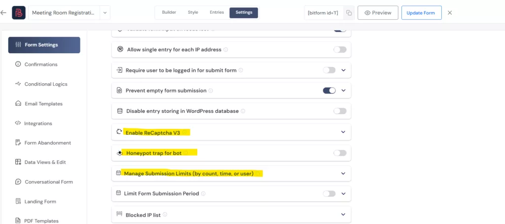
📌Note: Besides advanced spam protection, you can prevent empty submissions and block specific IP addresses with Bit Form.
Not receiving mail after form submissions? That’s a concerning WordPress contact form mistake.
Most hosting providers do not properly authenticate these emails, so Gmail, Outlook, and other providers treat them as suspicious and send them straight to spam or block them entirely.
Suppose you have 50 applicants who fill out your contact form every day and never know it, because not a single notification ever reaches your inbox. Here, the solution is that you need to set SMTP. This will route your emails through a properly authenticated delivery service. Bit Form has built-in SMTP support in both free and Pro versions. After setting it up, always send a test submission right away and check that the email lands in your inbox, not spam.
Imagine you fill out a form, click on the submit button, and then see a blank page, nothing else. No confirmation message, no redirect. What would you naturally presume? Something went wrong; maybe the form was not submitted. Keeps the user in a dilemma.
This WordPress contact form mistake is not acceptable. It immediately breaks users’ trust and often leads to duplicate submissions, which wastes your time sorting through.
So to avoid this form mistake, you should set a confirmation message, like displaying a success message directly on the form, “Your form was submitted successfully,” or redirect users to a thank-you page. Any of these notifications tells the user that their submission was received and sets a positive tone for what comes next.
If you are not tracking your form’s performance, you are making decisions blindly. You have no idea how many people viewed the form, how many started filling it out, where they dropped off, or which fields caused the most friction. Without this data, improving your form is just guesswork.
To keep track of form entries effectively, it is better to use a form builder that includes built-in analytics, just like Bit Form does.
Submission Stats:

Advanced Field Wise Report:
Did you notice the insights in these screenshots? They are quite helpful for a site owner. You get to see on which dates your form received the most submissions. You can also analyze the reports based on individual form fields to better understand how users are interacting with your form.

Building the form and publishing it are two different things. Many site owners never actually fill out their own form as a visitor before it goes live. This is a mistake that can cost you heavily.
A typo in the notification email address. A conditional logic rule that misfires. A redirect page that returns a 404 error. A field that shows up blank on mobile. These issues do not show up in the admin panel. They only appear when someone actually tries to use the form.
Make it a habit to submit a test entry after every change, check that the notification arrives in the right inbox, verify the confirmation works, and test it from your phone. It takes five minutes and prevents weeks of silent lead loss.
Another horrible mistake that most WordPress users make is placing the form in irrelevant places. Sometimes, it is placed in spots where visitors rarely notice and are difficult to find. Sometimes they appear at the bottom of the page, or on a page where it doesn’t belong. As a result, your form gets fewer interactions, and your conversion rate drops.
Therefore, to avoid this contact form mistake, it is best to position the forms on the pages:
Commonly, on landing pages, placing the form near the main value proposition often increases conversions. Similarly, a newsletter signup form is more effective when placed in the blog sidebar, after an article, or in the footer, where readers naturally look for updates.
Now here is the bonus as I promised at the start.
You just went through 10 WordPress form mistakes. And honestly, trying different plugins one by one to see which one avoids all the mistakes is exhausting. That is where having the right form builder changes everything.
Bit Form is a lightweight yet powerful WordPress form builder that is specifically built to handle all of these situations without needing any extra plugins or paid add-ons. In fact, they are included within the basic functionalities of the plugin. The form plugin is capable of doing more; it has various advanced features for different purposes. Here is how it directly addresses every mistake on this list.

Whether you are building a simple contact form or a complex multi-step lead generation form, Bit Form gives you everything you need for under $29.
WordPress form mistakes are not always obvious. Most of them work silently in the background, costing you leads and conversions without ever throwing an error. But now that you know what to look for, fixing them is straightforward.
Go through your forms today using this list as a checklist. Even fixing two or three of these mistakes can make a noticeable difference in how many people actually complete your forms and reach out. And if you want a form builder that handles most of this for you out of the box, give Bit Form a try. It is free to get started.