Bit Form V3 Coming Soon..

Offer ends in:
00
days day
00
hours hour
00
Mins Min
00
Secs Sec
days day
hours hour
Mins Min
Secs Sec
Building a WordPress form is not only about adding fields. You also need to move between forms, adjust field settings, style layouts, preview the form on different devices, and manage entries after submission.
At Bit Apps, we’re making form building on WordPress as efficient, customizable, and user-friendly as possible. We’ve heard your feedback, and we’re excited to introduce Bit Form Version 3, the easiest experience in WordPress form building!
Bit Form V3 keeps the familiar form-building workflow, but rebuilds the dashboard, builder, styling system, preview experience, and several form management areas. It also adds important new capabilities such as multi-site support, email OTP verification, responsive preview modes, and better entry export control.
In the competitive world of form plugins, usability matters. Bit Form was already praised for its simplicity and speed. Users found its drag-and-drop interface “a breeze to use” even with a wealth of functionality.
Version 3 takes that foundation and builds on it, focusing on user-friendly form builder improvements that help you create forms faster and more easily. From a completely revamped builder UI to advanced styling and multi-site capabilities, let’s explore the highlights of this update and how they upgrade your form-building experience.
With Version 3, the focus is entirely on improving your experience within the dashboard. While the core features, integrations, and form settings remain the same, the updated UI/UX design ensures that you spend less time figuring out how to use the plugin and more time building forms that work for your site.
Before we dive deeper, here’s a quick overview of the major improvements introduced in Bit Form V3.
| Feature Area | Before V3 | After V3 | Why It Matters |
|---|---|---|---|
| Architecture NEW | Single-site only | Full WordPress multisite support | Enables agencies and networks to manage forms across multiple sites with less friction. |
| Form Switcher NEW | Exit builder to switch forms | Inline drop-down switcher in the builder header | Switch between forms instantly without leaving the builder. |
| Forms Dashboard UPDATED UI | Flat list with minimal info | Visual overview with submission stats | Makes form navigation and form management easier at a glance. |
| Field List UPDATED UI | Single column, unorganized | Two-column grid, categorized by field type | Reduces search time and makes the field panel easier to scan. |
| Field Options Panel UPDATED UI | Single right-side panel | Left panel split into Basic, Advanced, and Conditional | Gives faster access to the right settings without scrolling through one long panel. |
| Adding Fields NEW | Drag from the field list only | Inline Add Field button with hover modal | Speeds up form building and reduces unnecessary mouse movement. |
| Conditional Logic IMPROVED | Separate section in the builder | Available directly in field settings | Keeps simple field logic close to the field you are configuring. |
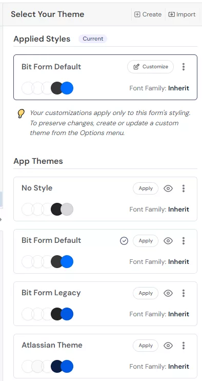
| Custom Themes NEW | Not available | Create, duplicate, edit, export, and delete custom themes | Gives teams better control over reusable form styling. |
| Theme Portability NEW | Not supported | Export and import from a form or file | Makes it easier to reuse form styles across sites, projects, and teams. |
| Style Layers UPDATED UI | Single scrollable panel | Split into Common, Multi-Step, and Individual sections | Organizes styling in a way that matches how users usually design forms. |
| Theme Quick Tweaks Panel UPDATED UI | Flat single-column list of all style properties | Collapsible sections for Form, Label, Input Field, Others, and Global toggle | Makes it clearer what part of the form you are styling. |
| Interaction States NEW | Not available in the Common layer | Hover and Focus state styling added | Gives designers and developers better control over field interaction styles. |
| Email OTP Verification NEW | No email verification option available | Built-in email OTP verification | Helps verify real users and reduce fake or incorrect email submissions. |
| Accessibility Improvements IMPROVED | Limited accessibility support in some areas | Improved aria-label, error handling, and hidden field accessibility | Makes forms easier to use for more visitors and supports better accessibility standards. |
| Conversational Forms IMPROVED | Was available | Improved functionality and user experience | Makes conversational forms easier to build, navigate, and complete. |
| Name Field + Email and Password Confirmation NEW | Required extra manual setup for confirmation fields | Added name field and confirmation options for Email and Password fields | Helps users collect more accurate information during signup or registration. |
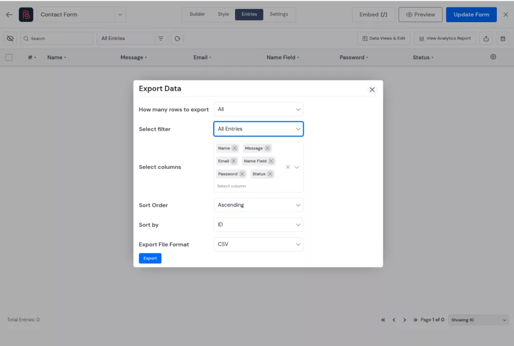
| Entries Filter IMPROVED | Basic filtering experience | Improved filter UI for entries | Makes it easier to find, sort, and manage form submissions. |
| Entry Export IMPROVED | Export available with limited control | Select Columns option before export | Lets users export only the data they actually need. |
| Responsive Preview NEW | Standard preview with desktop view only | Device-responsive preview modes for desktop, tablet, and mobile | Useful for checking form layouts across devices before publishing. |
Now let’s explore these updates in more detail and show you the updated dashboard with screenshots so you can see how we’ve made things simpler and more efficient.
Managing forms across multiple WordPress sites can take extra time, especially for agencies, freelancers, and teams working with client networks. Each site may need its own forms, themes, and settings. When those elements have to be recreated manually, it becomes harder to keep the form-building workflow consistent across different projects.
Version 3 introduces true multi-site architecture support. You can now manage forms across a WordPress network from a single installation. This is very useful for developers and agencies who maintain client networks. Instead of logging into five dashboards to update a form, you handle it once.
Why it matters: WP Multisite powers tens of thousands of educational platforms, news networks, and agency client portfolios. Until now, Bit Form was practically incompatible with that workflow. V3 fixes that completely.
Opening Bit Form V3, the first thing you’ll notice is the cleaner forms dashboard. It is easier to scan, more organized, and gives you useful form details without extra clicks.
Instead of showing only a basic list of forms, the new dashboard gives each form more context. You can quickly check key details like entries, views, completion rate, creation date, and available actions from one place.
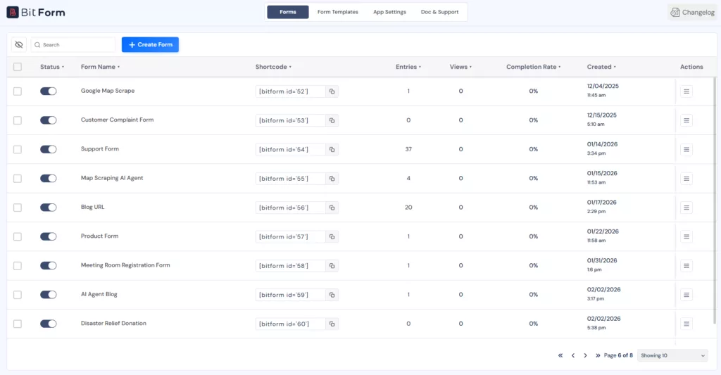
It’s a small change on paper. But it saves several clicks every single day.
Bit Form V2 already gave users a working visual builder with drag-and-drop form creation. In V3, the builder experience becomes more polished, easier to scan, and more comfortable to use during longer form-building sessions.
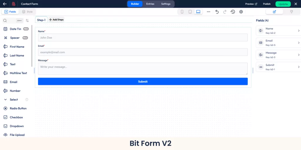
The updated interface gives more space to the form canvas, improves visual balance, and makes the main controls easier to notice. Field areas, settings, and builder actions now feel more organized, so users can understand where to work without spending extra time looking around.
Bit Form V3 also improves typography across the builder. Text sizing feels clearer, section labels are easier to read, and the overall layout creates a more focused editing experience.
For users who build simple contact forms, this makes the process smoother. For users working on longer forms, registration forms, multi-step forms, or client projects, the cleaner builder layout makes day-to-day form creation easier to manage.
This might sound like a small change, but once you experience it, you won’t want to go back.
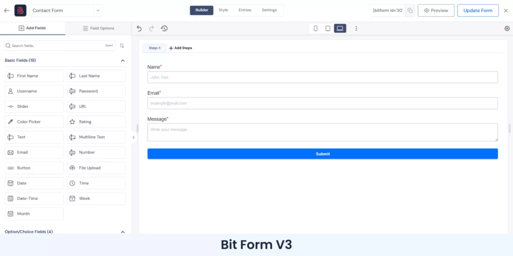
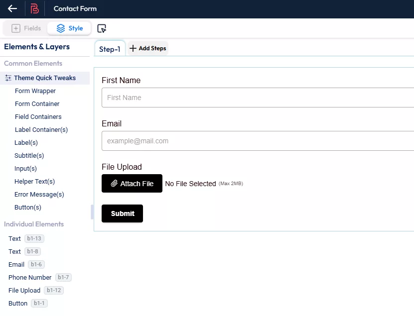
Bit Form V2 already included all the essential fields users need to build different types of forms. The only limitation was that the field list appeared in a single long column, so finding the right field could take a little more time, especially when working with longer or more advanced forms.
Bit Form V3 improves that experience with a two-column field layout and clear field categories.
Instead of scanning one long list, you can now find fields from organized groups such as Basic Fields, Option/Choice Fields, Advanced Fields, Payment Fields, Spam Protection/Captcha, and Elements.
This makes the builder easier to use for both new and existing users. New users can understand the available field types faster, while regular users can build forms with less searching and fewer extra clicks.
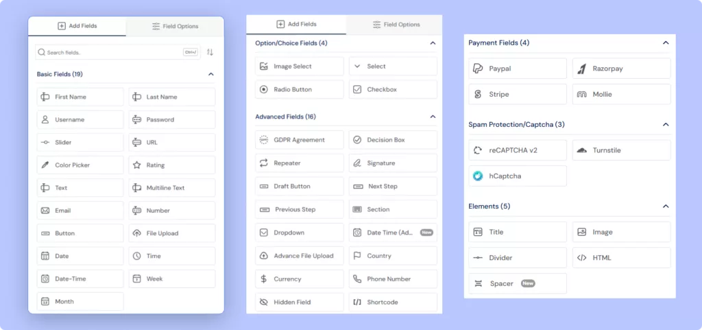
The result is a cleaner field selection experience where you can focus more on building the form and less on finding the right field.
Bit Form V2 already gave users access to the field settings needed to customize labels, placeholders, validation, and other field behavior. The only limitation was that these options lived in one longer panel, so finding advanced or conditional settings could take a little more time when working on complex forms.
Bit Form V3 improves that experience by moving field options to the left panel and organizing them into clear sections: Basic, Advanced, and Conditional Logic.
This makes field setup easier to follow. You can use Basic for common settings like labels and placeholders, Advanced for validation and custom options, and Conditional Logic for rule-based field behavior.
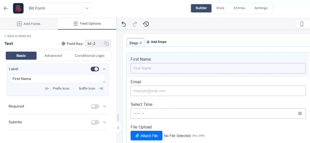
For simple forms, this keeps the editing experience clean. For longer forms with more advanced settings, it reduces extra scrolling and helps you find the right option faster.
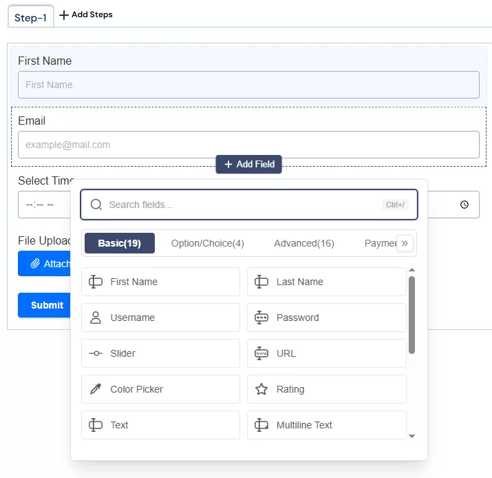
One of the more clever UX additions in V3 is the new contextual field picker. When you hover over an existing field in the builder, an Add Field button appears inline. Clicking it opens a field picker modal right where you are, so you can insert a new field without scrolling up, finding the field list, dragging, and repositioning.
It sounds small until you’re building a 20-field form and realize you’ve added eight fields without touching your mouse wheel once.
V3 adds a form switcher inside the builder itself. If you’re working on one form and realize you need to reference or switch to another, you no longer have to exit the builder, go back to the dashboard, and navigate into the second form. The switcher is right there.
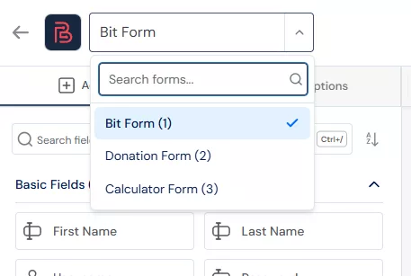
For anyone who maintains multiple forms or builds variations of the same form, this is a quality-of-life improvement that pays off quickly.
Conditional logic used to be a separate concern in Bit Form. You’d build your form, then go to a different section to set up visibility rules. V3 brings basic conditional logic directly into the field settings panel.
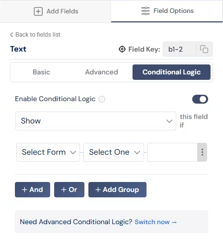
You can now set a field to show or hide based on the value of another field, right there in the Advanced settings, without leaving the field you’re configuring. For straightforward use cases like showing a phone number field only when a user selects “Yes, contact me,” this is exactly where the setting should live.
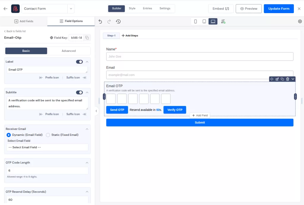
Bit Form V3 adds built-in email OTP verification, which was not available in V2.
This is useful when you need more reliable submissions from registration forms, signup forms, contact forms, lead forms, or any form where the email address matters. Instead of accepting any typed email address, you can ask users to verify their email before the submission is completed.
V3 also improves accessibility across key form areas, including better aria-label support, improved error handling, and better hidden field behavior.
For site owners, this means forms can offer a cleaner experience to a wider range of visitors.
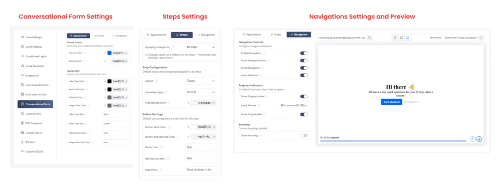
Conversational forms were already available in Bit Form V2. In Version 3, we focused on improving the interface and overall user experience.
Bit Form V3 also makes common form setup easier with dedicated improvements for Name, Email, and Password-related fields.
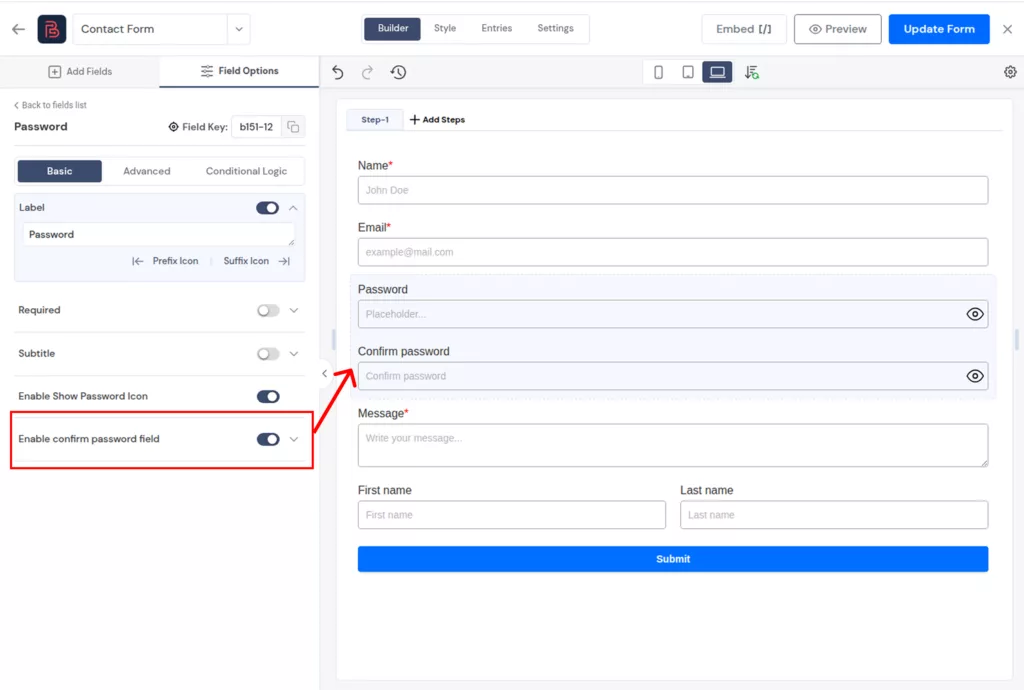
This is especially useful for signup forms, registration forms, account creation forms, and onboarding forms, where one small typo can create problems later.
V3 ships with new pre-built themes that actually look like they were designed for production use. Previous themes leaned minimal to the point of being forgettable. The new options cover modern, clean aesthetics that work across a range of site styles without requiring customization.
If you’ve used the Theme Quick Tweaks panel in V2, you know exactly what it looked like. One long flat list: Accent Color, Background Color, Font Color, Field Background Color, Border, Font Family, Field Sizes, Font Size, Label Alignment. All stacked together under a single Global heading with no separation between what affects the form container, what affects labels, and what affects input fields.
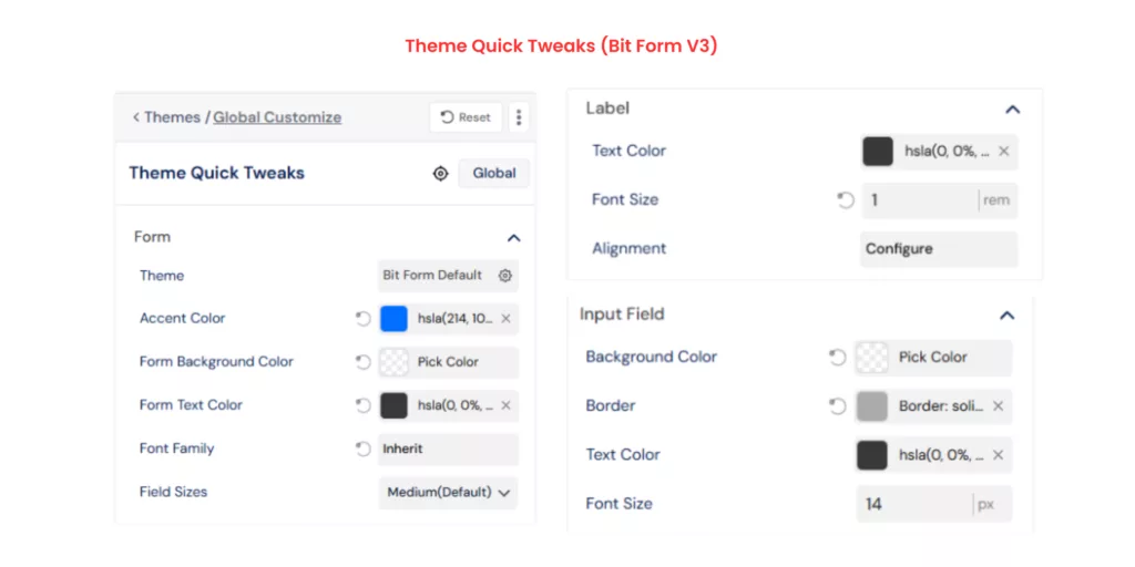
It worked, but the moment your form had more than a few styling needs, the panel felt cramped and hard to navigate. You’d change a font color and wonder if it was the label color or the input text color. You’d tweak a border and realize it affected something you didn’t intend.
V3 restructures the entire Quick Tweaks panel. The same settings are now organized into collapsible sections: Form, Label, Input Field, and Others. The Form section handles accent color, background, text color, font family, and field sizes. Label gets its own dedicated block for text color, font size, and alignment. Input Field and Others follow the same logic.
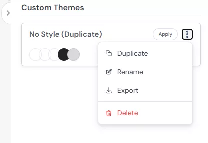
One of the most requested features was better custom theme management. In V3, you can now duplicate a theme to use it as a starting point, edit it directly, export it for use on other forms or sites, and delete ones you no longer need.
For designers and developers who build forms for clients, this workflow is a game-changer. You build a theme once, export it, and deploy it everywhere.
Building on that, V3 lets you export a theme directly from a form (grabbing its current styling as a reusable theme) or export it as a standalone file. Import works the same way. You can receive a theme file from a colleague, import it, and apply it immediately.
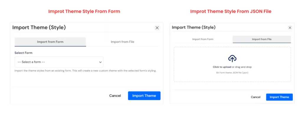
This is the kind of collaboration-friendly feature that turns a solo tool into a team tool.
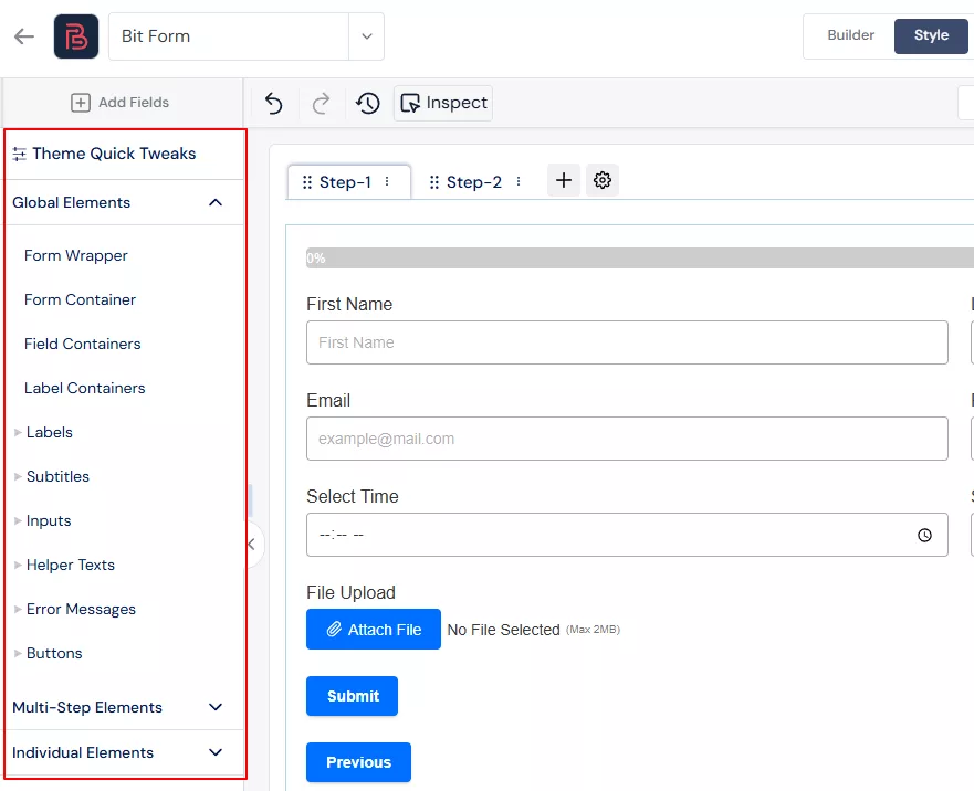
The style panel in V2 was a long, scrollable section with everything in one place. Finding the right layer to style meant scrolling past settings you didn’t need to reach the ones you did.
V3 separates the style layer UI into three clear groups: Common (global form styles), Multi-Step (styles specific to multi-step form navigation), and Individual (per-field overrides). The hierarchy makes logical sense and mirrors how most designers actually think about styling a form.
V3 adds hover and focus state customization to the Common style layers. You can now define how fields look when a user hovers over them or when they’re actively focused, using the standard CSS interaction states. This was a notable gap in previous versions and a common source of frustration for developers trying to match form styling to the rest of their UI.
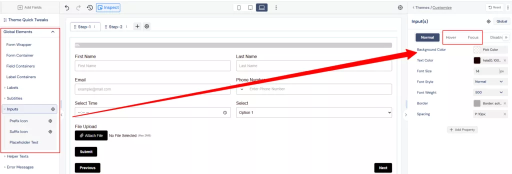
The Common layer also expanded its style property coverage significantly in this release.
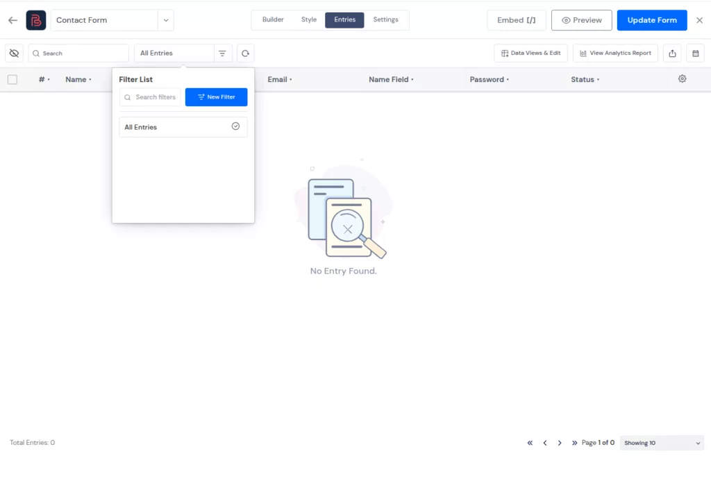
V3 makes it easier to filter and find specific form submissions from the Entries page.
You can create and manage filters more clearly, so reviewing entries feels faster and less messy.
V3 lets you choose which columns you want to include before exporting entries. This gives you cleaner export files with only the data you actually need.
The preview page in V3 gets a meaningful upgrade. You can now switch between different viewport breakpoints directly in the preview, simulating how your form shows on mobile, tablet, and desktop.
The appearance controls give you a better representation of what a real user will see, including form styling, layout behavior, and responsive breakpoints. Before this, you’d publish the form and check it on your phone to see if it looked right. Now you check before you publish.
It’s the kind of feature that prevents the embarrassing “sorry, the form looked weird on mobile” conversation.
Bit Form V3 is a major step forward, but the roadmap does not stop here. The team is already working on more features to make form building more flexible, practical, and easier for real WordPress use cases.
Upcoming improvements include a dedicated Address Field, email notifications when an integration fails, Poll / Survey Form support, and AI Form Templates to help users create forms faster.
These updates will continue to improve how users build, manage, and automate forms with Bit Form.
Ready to experience the new Bit Form Version 3? Upgrade today to get started with a cleaner, faster, and more intuitive WordPress form builder. As always, we’re here to help – feel free to reach out with any questions or feedback.
Bit Form V3 mainly improves the dashboard, builder UI, styling workflow, preview experience, and form management areas. It also adds features like multi-site support, email OTP verification, and better export control.
Existing forms should continue to work, but it is still smart to back up your site and test important forms after updating, especially if they use payments, conditional logic, or custom styling.
The biggest improvement is the cleaner builder experience. Field settings, styling options, form switching, preview modes, and entry management are easier to access and manage.
Yes, Bit Form V3 adds multi-site support, which is useful for agencies, freelancers, and teams managing forms across multiple sites in a WordPress network.
Yes. Bit Form V3 includes built-in email OTP verification, so users can confirm their email address before completing form submission.
Yes. Bit Form V3 lets you choose specific columns before exporting entries, which helps you create cleaner export files with only the data you need.
Bit Form V3 adds WordPress multisite support and better theme portability. Agencies can manage forms across site networks and reuse form styles across different projects more easily.
You can update if you want the new builder experience and added features. For production sites, it is better to back up your site first and test important forms after updating, especially forms with payments, conditional logic, or custom styling.


 EN
EN  ES
ES  DE
DE