Multi-step forms are everywhere in 2026, from meal kit subscriptions to real estate sign-ups.
Why? Because they turn long, boring forms into interactive experiences that increase conversion rates.
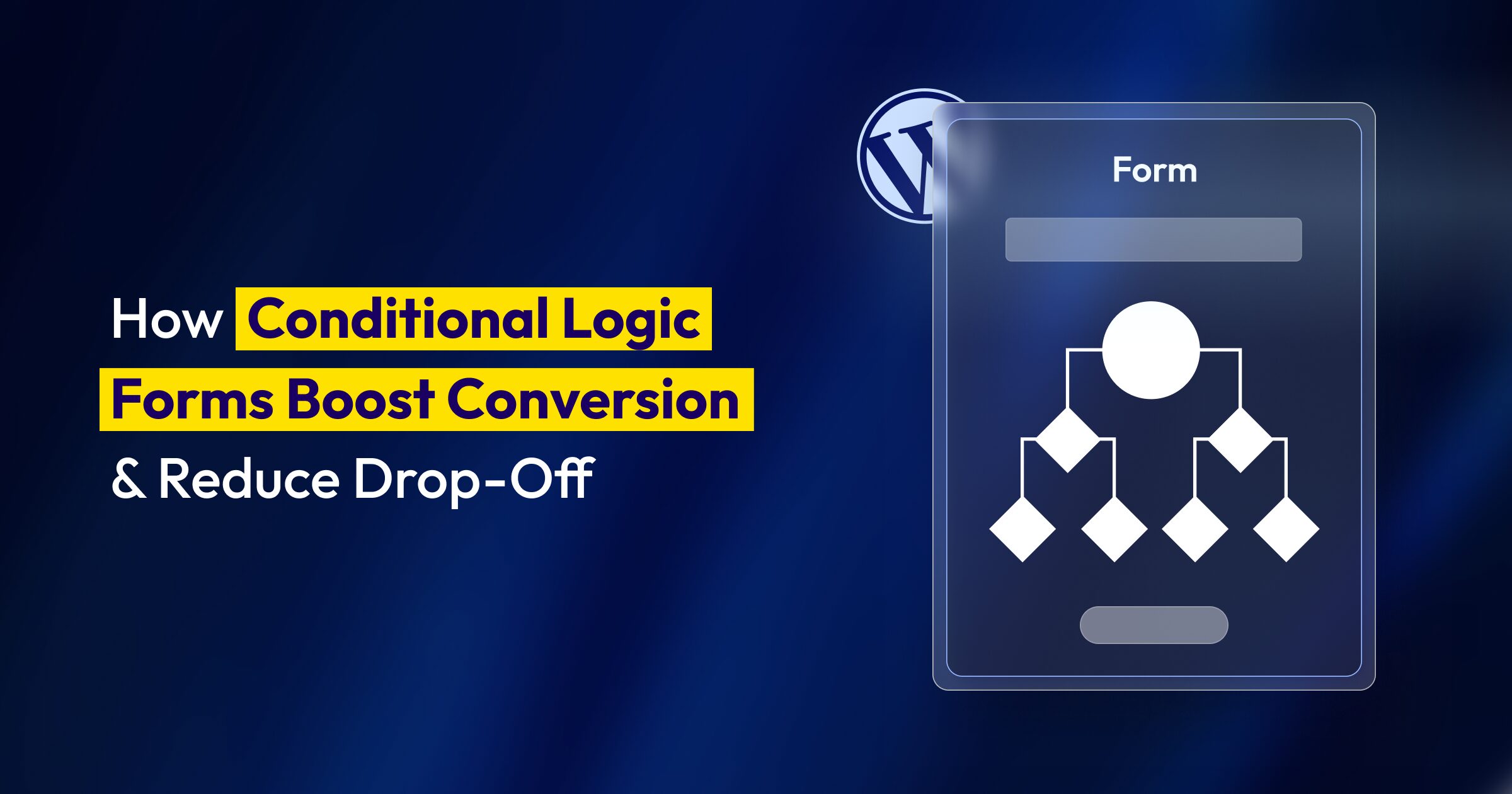
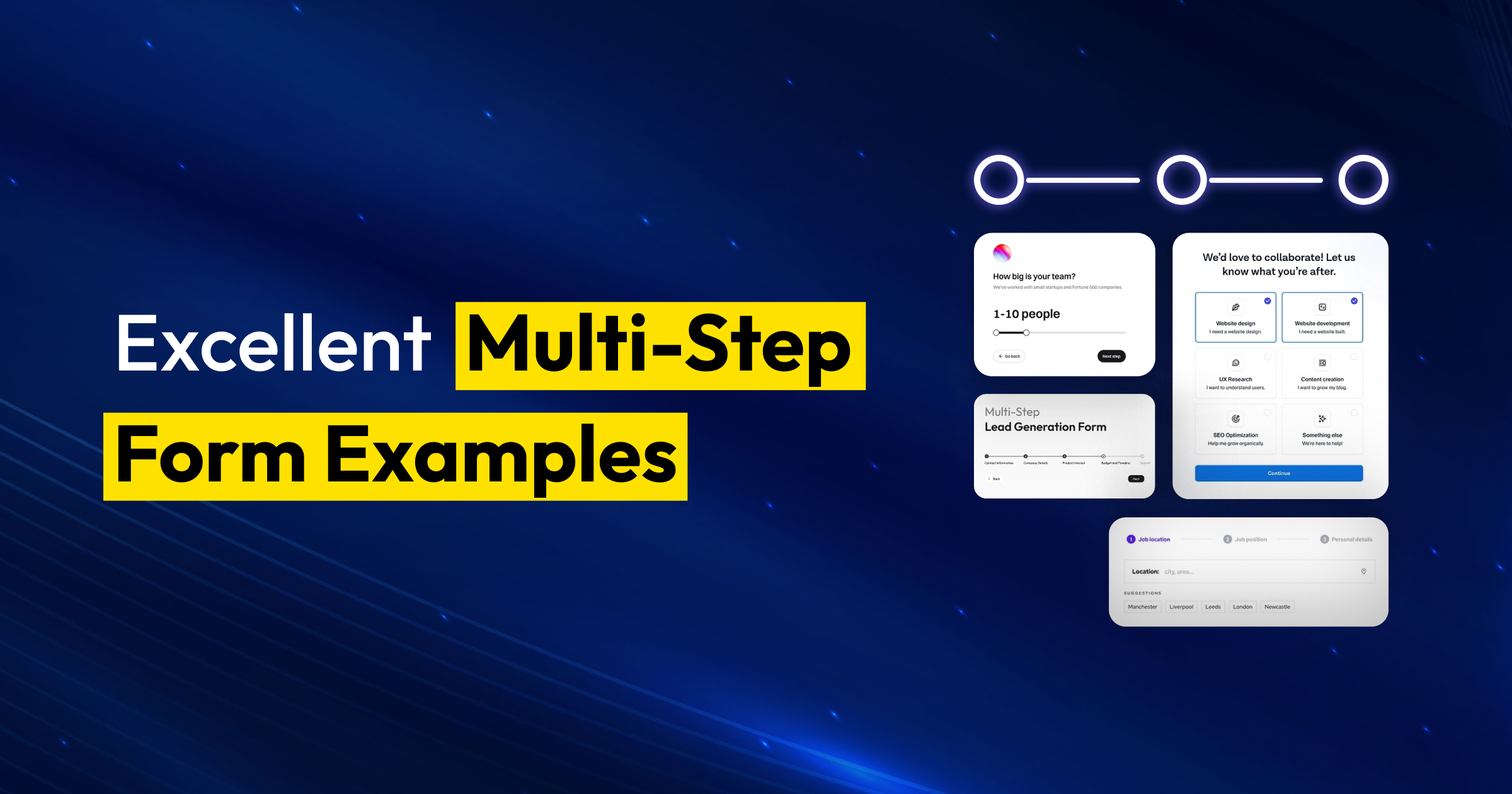
In this article, I’ll explore 8 Excellent Multi-Step Form tricks from leading brands, and analyze what makes them work. By the end, you’ll know exactly what makes these forms work and how to create your own for free.
Let’s talk about why breaking a form into steps isn’t just a design trend; it’s based on how people think.
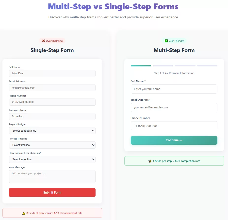
Think about the last time you started filling out a long form. You probably felt a little overwhelmed, right? That’s cognitive load in action. Your brain looks at all those fields and thinks “this is going to take forever” before you’ve even typed a single character.
Research shows that multi-step forms can boost conversions by up to 300% compared to their single-page forms. Some studies have found completion rates jumping from 10% to 53% just by breaking the form into logical steps.
Here’s what happens in your visitor’s brain: When they see a multi-step form, each screen feels manageable. Three fields? Easy. They fill those out. Then they see a progress bar showing they’re 33% done.
That small win triggers something called commitment bias; they’ve already invested time and effort, so they’re more likely to finish. It’s the same reason you’ll sit through a terrible movie if you’re 45 minutes in. You’ve committed.
Now compare these two experiences: Opening a form and seeing fields for name, email, phone, company, role, team size, industry, budget, timeline, pain points, current solution, decision-making authority, and timeline. Versus: Seeing three fields that ask, “Let’s start with the basics, “What should we call you?” The second one feels like a conversation, not an interrogation.
But won’t people drop off between steps? It’s a valid concern. The data tells us that if each step is designed thoughtfully, drop-off rates between steps are actually lower than abandonment rates on single-page forms. The key is momentum. Get someone to complete step one, and they’re psychologically invested in completing step two.
The real transformation happens when you combine this psychological foundation with smart design choices. That’s exactly what these eight examples do brilliantly.
Not every form needs multiple steps. If you’re just collecting an email address for a newsletter? One field works fine.
But if you want:
Then multi-step forms are your best friend.
Think about it this way: Would you ask someone to marry you on the first date? Probably not (unless you’re on a reality TV show). Forms work the same way. Build trust step by step before asking for phone numbers and budget details.
I analyzed dozens of multi-step forms across different industries to find what actually drives completions. Each example below shows a specific technique you can steal, whether you’re collecting leads, qualifying prospects, or onboarding users. Notice how these companies ask questions, ask for contact information, and keep users moving forward.
After detailed analysis, I have chosen the following 8 excellent multi-step forms that apply incredible strategies to get more leads. Let’s check.

Industry: HVAC / Home Services
What they did right: HVAC emergencies don’t wait. Their form starts by asking for your ZIP code so that they can quickly check to see if contractors are available in your area.
Once they confirm service coverage, the form moves to “What do you need?” Here, they can choose from various options like hiring a handyman, cleaning the house interior, installing or repairing plumbing, replacing or installing an asphalt shingle roof and many more.
Then they ask about timing: “When do you need this done?” Urgency options range from “Emergency – Today” to “I’m flexible.” This helps match you with available contractors immediately.
Only after understanding your HVAC needs and timeline do they ask for your name and phone number? That comes at step 7 or 8, after you’re invested and they’ve demonstrated value by showing contractor availability in your area.
Why it works: The hook for HVAC and home service forms is urgency. They respect that you’re stressed and need solutions, not another annoying form, by putting the problem first instead of collecting contact information.
Key takeaway: In industries that need quick service (like HVAC, plumbing, and electrical), start with the problem and the time frame. Only get their contact information after you’ve shown that you can help them.

Industry: Food Delivery / Subscription
What they did right: HelloFresh makes choosing your meal plan into a fun, visual experience. You see meal photos, click what looks good, and watch your weekly menu build in real-time on the side.
Instead of “How many servings?” they ask “Who’s eating?” with options like “Just me,” “Me and my partner,” or “My family.” The language is human.
As you progress, they show what you’re getting: “Your box will contain 3 meals for 2 people.” No mystery about what arrives at your door.
Why it works: Instant visual feedback is very useful. Seeing your choices pile up in the preview box makes you happy. You’re not just answering questions; you’re making something.
The imagery matters hugely here, beautiful food photos make the task enjoyable. You’re getting hungry while “filling out a form” (though it doesn’t feel like a form anymore).
Key takeaway: Use pictures and previews in real time to make choices that are hard to understand seem real. Let users see what they’re getting.

Industry: EdTech / Language Learning
What they did right: Duolingo’s onboarding feels less like filling out a form and more like making your learning experience unique.
“What language do you want to learn?” → “Why are you learning (language)?” → “How much time can you commit daily?”
Each answer shapes your experience. You’re not just providing data; you’re co-creating your learning path. That makes every question feel purposeful rather than nosy.
They also set immediate expectations with time commitments: “5 minutes a day” vs. “15 minutes a day.” You’re imagining your commitment before you sign up completely.
Why it works: Personalization gives people a sense of ownership. When the questions directly affect your experience, answering them feels useful instead of boring.
An exciting choice at the beginning, like “Pick your language!” gets people excited. You’re already imagining speaking Spanish or Japanese by step one.
The visual progress bar, combined with encouraging messages (“Great choice!” “You’re almost done!”), maintains momentum beautifully.
Key takeaway: Make every question feel like it’s personalizing the user’s experience, not just feeding your database.

What they did right: Nexus Nutrition knows that discount codes and special deals are great ways to get people to buy supplements, since people in this industry are often price-sensitive and loyal.
They do a great job of using gamification in their multi-step form. “CONGRATULATIONS! YOU’VE JUST UNLOCKED A MYSTERY DISCOUNT” on the first screen gets people excited, and then “Ready to see what you got?” This mystery part makes people want to know more and makes finding out about the discount feel like winning a prize.
When you enter your email, the second screen shows you the reward: “YOUR DISCOUNT IS 10%,” along with clear instructions on how to get it at checkout. The yellow “TEXT MY CODE” button makes things even easier by sending the code to customers’ phones so they don’t lose it.
The third screen says “YOUR INVITE: NEXUS SMS CLUB,” which is even more direct. It’s not just about getting a discount; it’s about being part of a special group. The copy promises “early access to deals, new product launches, restocks, and more,” turning a simple discount into a long-term relationship.
Each step is visually appealing with the product prominently displayed, tropical fruit imagery that suggests flavor and freshness, and a consistent dark blue background that conveys premium quality.
Why it works: The progressive reveal keeps users engaged. Instead of asking for contact information right away, they build interest with the mystery discount, give immediate value with the reveal, and then invite you to something even better, the SMS club. Each step feels like a reward, not a request.
Key takeaway: For e-commerce and supplement brands, gamify your opt-in process. Use mystery discounts, progressive reveals, and exclusive club invitations to make giving you their contact information feel like gaining access to something valuable rather than just another email signup.

Industry: Insurance
What they did right: GEICO does something brilliant; they give you a reason to continue at every step.
They also use advanced conditional logic. If you select “I own my home,” the next questions adjust accordingly. They’re not wasting your time with irrelevant fields.
Why it works: Motivation matters. When you understand why you’re answering something and what you’ll get, you’re far more likely to continue. GEICO frames data collection as a value exchange, not interrogation.
Their progress bar is chunky and satisfying. You can literally see yourself getting closer to that quote, and the anticipation builds.
Key takeaway: Tell people why you need their information and what benefit they’ll receive. Make the value exchange crystal clear.

Industry: Fleet Management
What they did right: The first question in GoMotive’s multi-step form is “What’s your industry?” It’s a simple but smart question. They show six clear choices, each with its own icon: Trucking, Construction, Public Sector, Oil and Gas, Field Services, and All Others.
This isn’t just gathering information. Smart segmentation is what makes everything else happen. GoMotive can tailor the questions, show relevant use cases, and speak your language based on whether you manage garbage trucks or construction equipment.
The design is clean and touch-friendly cards on a dark background with simple iconography. No overwhelming text blocks. Just “STEP 1 OF 3” and a straightforward question. You know exactly how much commitment this requires.
The progression indicator at the top removes anxiety. Three steps feel manageable. You’re not signing up for a marathon.
Why it works: Starting with industry selection demonstrates that GoMotive understands its customers aren’t all the same. A trucking company’s fleet challenges differ massively from a municipal government’s needs.
This first question likely triggers conditional logic; what you see in steps 2 and 3 probably adapts based on this choice. That means fewer irrelevant questions later, higher completion rates, and better-qualified leads for their sales team.
Key takeaway: Lead with a question that lets you personalize the rest of the journey. Use that first interaction to gather context, not just data. When users feel understood immediately, they’re more likely to continue.

Industry: Talent Marketplace / Freelance Hiring
What they did right: Toptal’s multi-step form opens with “Who would you like to hire?” They present seven distinct role categories, each with its own icon and detailed subtitle explaining specializations.
This isn’t a vague “What do you need?” question. Instead of making you decode whether your React specialist falls under “Engineer” or “Technologist,” they spell it out: “Software Developer, Data Scientist, DevOps, QA…” Each card includes 3-5 specific role examples, so you know exactly where you fit.
Each option has a custom icon that’s simple and recognizable: code brackets for developers, a pen tool for designers, a growth chart for marketing experts. Visual pattern matching speeds up decision-making.
Why it works: Toptal serves multiple markets, and companies need vastly different things when hiring a developer versus a sales expert. By segmenting immediately, they can tailor the entire flow to ask relevant questions only.
The detailed subtitles make you sure. You don’t have to guess what “Designer” means; they tell you right away: “Web, Mobile, UI/UX, Branding, and Visual Designer.” This cuts down on people leaving because they are confused.
This question also lets Toptal know what kind of expertise they should expect. Seven clear categories show that “we understand the talent landscape” better than a generic “Tell us what you need” text box could ever do.
Key Takeaway: When you have to serve a lot of different people, being specific is better than being flexible. Users can quickly and confidently identify themselves when things are clearly organized and there are clear examples. Good labels and text that explain things help people make decisions.

Industry: Real Estate / Agent Services
What they did right: Zillow’s Premier Agent signup form is a masterclass in respecting people’s time. Right at the top, there’s a friendly progress bar with dots showing you exactly where you are in the journey. No endless scrolling mystery, just a clear visual roadmap.
The first question is brilliantly simple: “Who are you?” Three large cards with icons, a single person for agents/brokers, a house for home buyers/sellers, and two people for other professionals. One click and you’ve self-identified. Done.
Then comes the personal touch: “What’s your name?” Just first and last in a single field. Not “First name (required)” and “Last name (required)” in separate boxes like you’re filling out a DMV form. One clean input field that feels conversational form, not bureaucratic.
The “Continue” button is impossible to miss. It doesn’t say “Submit” or “Next.” It says Continue, which feels like progress, not commitment.
Why it works: Zillow understands their audience. Real estate agents are juggling showings, calls, and paperwork. They don’t have 20 minutes to devote to a signup form. This design screams, “We value your time.”
Key takeaway: Show people the roadmap before they start walking. Use clear segmentation to personalize the journey, and remove every possible friction point in those first steps. One simple question, one simple field, one obvious button. That’s how you get people to step two.
After analyzing hundreds of multi-step forms, patterns emerge. All of the winners get these psychological ideas right:
The Zeigarnik Effect: We remember tasks that aren’t finished better than completed ones. Our brains want closure once we start. Multi-step forms take advantage of this; when you start answering and then stop, it makes you feel stressed.
Progressive Commitment: Start with small commitments (easy questions) and work your way up to bigger ones. Users are already invested by the time you ask for phone numbers.
Goal Gradient Effect: The closer we get to finishing, the more motivated we are. That’s why progress bars are effective; they make you want to finish.
Social Proof and Trust Signals: The best forms have testimonials, user counts (“Join 50,000 happy customers”), or security badges in the right places. These reduce anxiety about sharing information.
You don’t need a developer to design multi-step forms like these. With WordPress form builder tools like Bit Form, you can design multi-step form for free without coding. Drag-and-drop builder, conditional logic, custom styling, and built-in analytics make creating professional multi-step forms accessible to everyone.
And the best part? You can create a multi-step form for free with 50+ built-in integrations.
Whether you’re building a WordPress multi-step form for lead generation, eCommerce, or a customer inquiry form, Bit Form helps you design, launch, and optimize it easily.
I’ve also seen countless forms fail. Here’s what stops conversions:
Hiding the progress: Every new step feels like a betrayal if I don’t know if I’m 25% or 75% done. Always show a sign of progress.
Asking too much too soon: Don’t start with “What’s your annual income?”. Build trust with easier questions first.
Poor mobile experience: More than 60% of form fills happen on mobile devices. You’re missing out on half of your potential conversions if your multi-step form isn’t easy to use with your thumb.
No way to go back: People make mistakes or want to change their answers. Removing the back button creates anxiety and abandonment.
Unclear next actions: After completion, what happens? When will they hear back? Mystery creates doubt. Set clear expectations.
Multi-step forms aren’t magic; they’re applied psychology. They work because they understand how the brain processes information and makes choices. They work because they help you feel less anxious, get things moving, and make the experience feel like you can handle it. They work because they change “Ugh, I have to fill this out” to “Oh, this isn’t so bad.”
The eight examples we looked at all use different methods, but they all follow the same basic rules: start simple, show progress, group logically, personalize with conditional logic, and design for mobile first. These aren’t optional nice-to-haves. They’re the difference between a 3% conversion rate and a 15% conversion rate.
You don’t need to rebuild every form on your site tomorrow. Start with one, your highest-traffic landing page or your most important lead capture form. Apply what you’ve learned here. Split it into logical steps. Add a progress bar. Write better microcopy. Test it.
Then see what happens. Watch your completion rates climb. Watch your cost-per-lead drop. Watch your sales team get better qualified leads because people actually finished filling out those qualification questions.
The best part? You’re not just improving your conversion rates. You’re making things better for your users. You’re making it less annoying and more enjoyable for them to interact with your brand. That’s a win that goes far beyond just analytics.
Are you ready to make your first multi-step form? Start with the basics, and keep in mind that every field you can get rid of or move to a later step is one less reason for someone to give up on your form. Your visitors will thank you. Your conversion rate will thank you. And your sales team? They’ll definitely thank you.
Multi-step forms are perfect for industries needing complex info, like insurance, real estate, loans, SaaS onboarding, service bookings, and e-commerce customization. Any business collecting 6+ fields or qualifying leads should use them.
Absolutely! Bit Form + Bit integration offers 150+ built-in free integrations with popular CRMs (HubSpot, Salesforce, Zoho), email marketing tools (Mailchimp, ActiveCampaign), Google Sheets, Slack, and automation platforms.
Yes, and you should! Bit Form’s conditional logic feature lets you create smart forms that show relevant questions based on user responses. For example, if someone selects “I’m a homeowner,” you can skip rental-related questions. This personalizes the experience, reduces irrelevant fields, and significantly improves completion rates.
Yes, Bit Form allows you to set up instant email notifications for form submissions with full customization. You can send notifications to different team members based on form responses, include submission data in the email, attach uploaded files, and even trigger automated workflows or follow-up sequences.
Bit Form automatically creates responsive forms that look great on any device, with progress indicators that remain clear on small screens and input fields optimized for touch interaction.
Bit Form includes multiple spam protection methods: Google reCAPTCHA v2 and v3 (invisible to users), honeypot fields (hidden fields that bots fill but humans don’t see), and time-based validation to flag suspiciously fast submissions.
With Bit Form, entries are securely stored in your WordPress database and accessible via the user-friendly dashboard. You can view detailed submission data, filter entries, export as CSV, and easily send submissions to external tools like Google Sheets, your CRM, or email through integrations, giving you complete control over your data.
Absolutely! Bit Form lets you display custom thank-you messages, redirect users to specific URLs (like a thank-you page or download link), or show success messages with next steps. Smart marketers use this to set expectations (“We’ll contact you within 24 hours”), offer resources, or trigger confirmation emails automatically.
Yes, Bit Form supports file uploads for images, PDFs, documents, and other file types with full control over accepted formats and size limits. You can also attach uploaded files to email notifications or store them in cloud services like Dropbox or Google Drive.
Most form builders let you export entries to CSV or Excel format. If you’re using Bit Form, you can automate this using Bit Integrations to send data directly to Google Sheets or CRM systems in real time.
Absolutely! Bit Form’s drag-and-drop builder lets you create professional multi-step forms without coding. Just add fields, organize steps, customize designs, set up conditional logic, and integrate with a few clicks.
Yes! Bit Form offers a free version that includes multi-step form functionality, conditional logic, email notifications, and 50+ built-in integrations.